| | |
Me: We made paper plate heads of ourselves,
measured our heights and attached a strip of
paper of the appropriate length. These we
mounted on the wall in the hallway as we lined up
our class from "Small to Tall."
We also made pictographs to represent our hair
and eye color. Children drew their heads only,
on small squares of paper which were then
easily glued to pre-made and laminated graphs,
one for eye color and another for hair color. It
was simple, visual and best of all reusable next
year if glue sticks or rubber cement are used to
attach the pictures.
Families: We produced a big book with each
of our families lined up from small to tall and
shown on a page in the book. Children drew
pictures of their families on large sheets of paper
(many included pets) which when bound into a
book became a popular shared reading addition
for the class.
Pumpkins: Prior to Halloween we predicted,
measured, weighed and finally carved our jack-
o-lanterns. We even counted all the seeds. We
presented our information about the pumpkins in
tables and graphs so that we were able to decide
whether the largest pumpkin always produced
the most seeds! The use of tallying can be
introduced as a way of recording information
prior to creating a graph.
Teeth: We gathered information as a
homework project on the kind of toothpaste,
number of visits to the dentist, lost teeth,
cavities, brushings per day, flossing, etc. All
information was placed on individual small 4 cm
X 4 cm tooth outlines so that it could be
displayed on the appropriate graphs as the
information arrived back at school (again these
are laminated sheets used again and again). We
interpreted this information each day as the
graphs changed. This brought in parent
participation as they helped students gather the
required information.
Grids: Using a large floor grid we named the
rows and columns using coordinates (letters
along the base and numbers up the side) such as
A4, C5, G3, etc. The children then stood on
appropriate named squares as we became
familiar with this way of representing
information. We later worked with map symbols
on 1-inch squared paper as we practised putting
our symbols at the correct coordinates. It was
great fun! Children even completed a homework
project with parents giving a coordinate for
Christmas symbols to be put on a grid.
Timelines: As a way of helping children
understand a sense of time, we each made our
own time line on long strips of paper (mine was
much longer than theirs). From birth to age six,
children either used real pictures of themselves
or pictures cut from magazines to represent
important accomplishments along the line.
These were often a new baby picture, age one
birthday, playschool, new bike, kindergarten,
and present time. Parents were most helpful in
getting these done. We then compared and
discussed differences. Interestingly some were
done horizontally, while others were vertical
timelines. Each timeline for the students was cut
lengthwise from chart paper so it was about a
metre long and 20 cm wide.
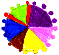
Favorites: These are fun whether we are
choosing favorite colors and building a cube-a-link graph, drawing cones and building an ice-cream graph, or doing arm spans and
handspans and making comparisons! We often
ask about personal choices whether we're doing
health, physical education, language arts, social
studies, science or mathematics. It is quick and
easy to tally, make a quick picture, or simply line
up by choice and so represent the data.
Snow and Weather: Weather is presently
being represented using a weather calendar, a
line graph to record the high and low
temperature, and a table where we recorded
information about our collected samples of snow
(we predicted and then measured temperatures,
cleanliness, amount of water and melt time of
four different snow samples). We had last year's
temperature chart and so are able to compare
this year's January weather with that of 1996 on
the same line graph by using different colors.
Even at grade one, children are able to read and
compare information from charts and graphs.
Chance: With the number of lotteries, bingos,
etc. evident in our society, children need
exposure to what "chance" is about. Bagging
different numbers of colored bears or cube-a-
links (1 orange, 2 yellow, 3 blue, 4 red, etc.) for
children to predict, draw and graphically
represent their results gives them some
understanding of why you may get more red than
orange draws. Draws continue with each player
drawing and then returning the object to the bag
before the next player draws. Play continues
until one of the colors on the graph has all
spaces filled. The use of a coin to graphically
represent heads and tails outcomes after 15 flips
also works well for children to experience data
representation and chance activities.
Other: We have made many graphs which
illustrate class favorites-foods, colors, and
activities just by using cube-a-links to represent
the data. When linked together we can visually
see and compare our favorites.
Another way to represent data is by using string
to show armspans, distances we can jump, etc.
These can then be taped to a chart with the
child's name beside the string. We are able to
then compare our representations by their
length with or without using standard
measurement.
|
|